Best practices for implementing a successful business intelligence strategy are crucial for any organization aiming to leverage data-driven decision-making. This involves a multi-faceted approach, from clearly defining business objectives and key performance indicators (KPIs) to selecting the right BI tools and ensuring effective data visualization and reporting. Mastering data acquisition, integration, and governance is equally vital, along with fostering user adoption and continuous improvement.
Let’s dive into the key steps to unlock the power of your data.
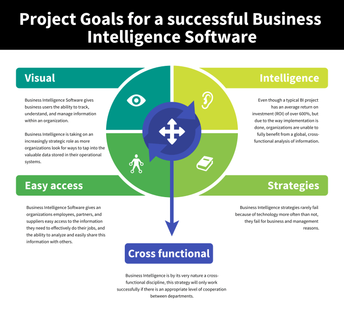
Building a robust BI strategy isn’t just about technology; it’s about aligning data insights with your overarching business goals. This requires a deep understanding of your KPIs, your data sources, and the tools best suited to analyze and visualize your information. This guide will walk you through each crucial step, from data acquisition and integration to implementation and ongoing optimization, helping you build a strategy that delivers tangible results.
Defining Business Objectives and KPIs
Aligning your business intelligence (BI) strategy with your overarching business goals is paramount for success. Without a clear understanding of what you’re trying to achieve, your data analysis efforts will be scattered and ultimately unproductive. A well-defined BI strategy acts as a compass, guiding your data collection and analysis towards actionable insights that directly impact your bottom line.Defining and tracking Key Performance Indicators (KPIs) is the cornerstone of this alignment.
KPIs provide quantifiable measurements of progress toward your business objectives, allowing you to monitor performance, identify areas for improvement, and make data-driven decisions. Choosing the right KPIs is crucial; selecting irrelevant metrics can lead to wasted resources and misdirected efforts.
KPI Identification and Definition
The process of identifying and defining KPIs begins with a thorough understanding of your business objectives. These objectives should be specific, measurable, achievable, relevant, and time-bound (SMART). Once your objectives are clearly defined, you can identify the specific metrics that will indicate progress towards achieving them. This often involves collaborating with stakeholders across different departments to ensure a comprehensive and relevant set of KPIs.
For instance, if a primary objective is to increase customer retention, relevant KPIs might include customer churn rate, Net Promoter Score (NPS), and customer lifetime value. Conversely, if the objective is to boost sales, KPIs could include conversion rates, average order value, and revenue growth.
Examples of SMART KPIs Across Business Functions
The following table illustrates examples of SMART KPIs across various business functions, demonstrating how they align with specific business objectives and how they are measured.
| KPI | Measurement Method | Target | Data Source |
|---|---|---|---|
| Website Conversion Rate | (Number of Conversions / Number of Website Visits) – 100 | Increase by 15% in Q4 2024 | Google Analytics |
| Customer Churn Rate | (Number of Churned Customers / Total Number of Customers) – 100 | Reduce to below 5% by year-end | CRM System |
| Average Order Value (AOV) | Total Revenue / Number of Orders | Increase by 10% in the next fiscal year | Sales Data |
| Marketing ROI | (Revenue Generated from Marketing Campaigns – Marketing Spend) / Marketing Spend | Achieve a ROI of at least 3:1 | Marketing Campaign Data, Sales Data |
| Production Efficiency | Units Produced / Labor Hours | Improve efficiency by 8% by the end of Q2 | Production Management System |
Data Acquisition and Integration: Best Practices For Implementing A Successful Business Intelligence Strategy
Building a robust business intelligence (BI) strategy hinges on the ability to effectively acquire and integrate data from diverse sources. This process, while crucial, can be complex, requiring careful planning and execution to ensure data quality and consistency. A well-structured data integration pipeline is the backbone of any successful BI initiative, enabling informed decision-making based on a unified view of your business.Data acquisition involves gathering information from various internal and external sources.
The success of your BI strategy depends heavily on the comprehensiveness and accuracy of this data.
Data Sources for Business Intelligence
Effective BI leverages data from a wide range of sources to provide a holistic view of the business. These sources can be broadly categorized as internal and external. Internal sources provide insights into operational efficiency and internal processes, while external sources offer a broader perspective on market trends and competitive landscapes.
- Internal Sources: Examples include CRM systems (customer relationship management), ERP systems (enterprise resource planning), marketing automation platforms, sales data, financial records, and operational databases. These sources provide granular details about customer interactions, sales performance, inventory levels, and operational costs.
- External Sources: These can include market research reports, social media analytics, competitor data, economic indicators, and publicly available datasets. These sources offer valuable contextual information to complement internal data and enhance the strategic value of BI insights.
Data Cleaning, Transformation, and Integration Methods
Raw data rarely comes in a format suitable for immediate analysis. Data cleaning, transformation, and integration are essential steps to ensure data quality and consistency. These processes aim to standardize data formats, handle missing values, and resolve inconsistencies before loading the data into a central repository.
- Data Cleaning: This involves identifying and correcting or removing inaccurate, incomplete, irrelevant, duplicated, or improperly formatted data. Techniques include outlier detection, handling missing values (imputation or removal), and data deduplication.
- Data Transformation: This step involves converting data into a consistent format suitable for analysis. This might include data type conversion, data aggregation, normalization, and the creation of new variables from existing ones. For instance, transforming date formats from various sources into a single standard format (e.g., YYYY-MM-DD).
- Data Integration: This involves combining data from multiple sources into a unified view. Methods include ETL (Extract, Transform, Load) processes, data warehousing, and data lakes. ETL tools automate the extraction, transformation, and loading of data into a target system, ensuring data consistency and accuracy. Data warehousing provides a structured, centralized repository for integrated data, while data lakes offer a more flexible, schema-on-read approach to storing diverse data types.
Data Integration Workflow Diagram
Imagine a workflow diagram depicting the data integration process. It would start with various data sources (CRM, ERP, Marketing Automation, etc.) Arrows would flow from these sources into an ETL process, represented as a central box. Inside this box, data cleaning and transformation would occur. Finally, a single arrow would lead from the ETL process to a central data warehouse or data lake, representing the unified data repository ready for analysis and reporting.
This visual representation clearly shows the flow of data from disparate sources to a single, consistent source for BI analysis.
Choosing the Right BI Tools and Technologies
Selecting the appropriate Business Intelligence (BI) tools is crucial for a successful strategy. The right tools will empower your organization to effectively analyze data, uncover valuable insights, and make data-driven decisions. A poorly chosen system, however, can lead to wasted resources, inaccurate analysis, and ultimately, hindered business growth. This section will explore factors to consider when choosing BI tools and provide a comparison of popular options.The selection process hinges on a careful evaluation of your organization’s specific needs, technical capabilities, and budget.
Factors such as data volume, required functionalities, user expertise, and integration with existing systems all play a significant role. Understanding these aspects allows for a targeted approach, maximizing the return on investment (ROI) of your BI solution.
BI Tool Feature Comparison
Choosing the right BI tool involves considering various factors. A critical aspect is understanding the differences in features, scalability, and cost-effectiveness among various options. The following table compares three popular BI tools: Tableau, Power BI, and Qlik Sense.
| Feature | Tableau | Power BI | Qlik Sense |
|---|---|---|---|
| Data Connectivity | Connects to a wide variety of data sources, including databases, spreadsheets, and cloud services. Strong support for big data integrations. | Excellent connectivity to various data sources, including Microsoft products, and strong cloud integration with Azure. | Connects to a broad range of data sources, boasting robust associative data exploration capabilities. |
| Data Visualization | Known for its intuitive drag-and-drop interface and visually appealing dashboards. Offers a wide array of chart types and customization options. | Provides a user-friendly interface with a comprehensive library of visualizations. Strong integration with Excel for familiar workflows. | Offers unique associative data exploration, allowing users to seamlessly navigate between related data points and discover unexpected insights. |
| Scalability | Highly scalable, capable of handling large datasets and supporting numerous users. Offers both on-premise and cloud deployment options. | Highly scalable, leveraging Microsoft’s cloud infrastructure for robust performance and ease of management. | Scalable solution, with options for on-premise and cloud deployments. Performance can be impacted by extremely large datasets. |
| Cost-Effectiveness | Offers various licensing models, including per-user and per-site licenses, catering to different organizational sizes and budgets. Can be expensive for large deployments. | Generally more affordable than Tableau, especially for organizations already using Microsoft products. Offers a free version with limitations. | Pricing models vary depending on the deployment and features required. Can be a cost-effective solution for certain use cases. |
| Ease of Use | Intuitive drag-and-drop interface, making it relatively easy to learn and use, even for users with limited technical expertise. | User-friendly interface, particularly for users familiar with Microsoft products. Extensive online resources and community support are available. | Steeper learning curve compared to Tableau and Power BI, requiring more technical expertise for advanced features. |
Best Practices for BI Tool Selection
Selecting the right BI tools requires a methodical approach. This involves aligning the chosen tools with the organization’s specific requirements and technical capabilities. Consider these best practices:Clearly define your business objectives and KPIs before evaluating any tools. This ensures you choose a tool that can effectively measure and track the metrics that matter most. For example, a retail company focused on optimizing inventory might prioritize tools with strong forecasting capabilities, while a marketing team focused on campaign performance would need robust data visualization and reporting features.
Failing to define objectives upfront can lead to selecting a tool that doesn’t meet the organization’s needs.
Data Visualization and Reporting
Effective data visualization is the cornerstone of a successful business intelligence strategy. It transforms raw data into easily digestible insights, allowing stakeholders to understand complex information quickly and make informed decisions. Without clear, compelling visuals, even the most insightful data analysis remains largely useless. The right visualization can illuminate trends, highlight outliers, and ultimately drive action.Data visualization techniques are incredibly diverse, each suited to different data types and business questions.
Choosing the appropriate method is crucial for effective communication. Poorly chosen visualizations can lead to misinterpretations and hinder decision-making. Conversely, well-chosen visualizations can dramatically improve understanding and facilitate faster, more effective decision-making processes.
Types of Data Visualizations and Their Applications
The selection of the right visualization depends heavily on the type of data and the question being asked. For instance, comparing sales figures across different regions might call for a different approach than tracking website traffic over time.
- Bar Charts: Ideal for comparing categorical data, such as sales performance across different product lines or customer demographics. A simple bar chart could visually represent the sales figures for each product line, with the length of each bar corresponding to the sales volume. This allows for easy comparison of performance across various categories.
- Line Charts: Best suited for showing trends over time, such as website traffic, sales growth, or stock prices. A line chart depicting monthly website visits would clearly show upward or downward trends, seasonality, and any significant spikes or dips in traffic.
- Pie Charts: Effective for showing proportions or percentages of a whole, such as market share or customer segmentation. A pie chart could illustrate the market share held by different competitors in a specific industry, with each slice representing a company’s percentage of the total market.
- Scatter Plots: Useful for exploring relationships between two numerical variables, such as advertising spend and sales revenue. A scatter plot showing the correlation between advertising expenditure and resulting sales would help identify if increased spending correlates with increased revenue.
- Heatmaps: Excellent for displaying large datasets with multiple variables, highlighting areas of high or low concentration. A heatmap could visually represent customer satisfaction scores across different regions, with darker shades indicating higher levels of satisfaction and lighter shades indicating lower levels.
Illustrative Visualizations of KPIs and Trends
Let’s consider a hypothetical e-commerce business. We can visualize several key performance indicators using different chart types.
Example 1: Monthly Revenue Growth
A line chart could depict monthly revenue over a year. The x-axis represents the months, and the y-axis represents revenue in dollars. An upward trend would indicate growth, while a downward trend would show decline. Seasonal peaks and troughs could also be easily identified. For example, a spike in December might reflect increased holiday sales.
Example 2: Customer Acquisition Cost (CAC)
A bar chart could compare CAC across different marketing channels (e.g., social media, email, search engine marketing). The x-axis would list the marketing channels, and the y-axis would show the CAC in dollars. This allows for easy comparison of the cost-effectiveness of each channel. For example, a significantly higher CAC for one channel would prompt an evaluation of its effectiveness.
Example 3: Customer Segmentation by Purchase Frequency
A pie chart could show the proportion of customers categorized by their purchase frequency (e.g., one-time buyers, repeat buyers, frequent buyers). Each slice would represent a customer segment, with the size of the slice corresponding to the percentage of customers in that segment. This helps understand customer behavior and loyalty. For example, a large slice representing frequent buyers suggests a successful loyalty program or strong product appeal.
Best practices for a successful business intelligence strategy hinge on data accuracy and accessibility. Integrating real-time data from your operations is key, and this is where leveraging manufacturing software becomes crucial. Such software provides the granular data needed for insightful analysis, ultimately enhancing your overall BI strategy and driving better decision-making.
Implementing and Managing the BI Strategy
Successfully deploying a Business Intelligence (BI) strategy isn’t a one-time event; it’s an ongoing process requiring meticulous planning, execution, and adaptation. A phased approach, coupled with robust change management and a strong focus on data governance, is crucial for maximizing ROI and ensuring long-term success. Ignoring these aspects can lead to project delays, budget overruns, and ultimately, a BI system that fails to deliver on its intended value.A phased implementation ensures a manageable rollout, minimizing disruption and maximizing user adoption.
Each phase builds upon the previous one, allowing for continuous improvement and refinement based on real-world feedback. This iterative approach fosters a more robust and adaptable BI system tailored to the evolving needs of the organization.
Phased Implementation Plan, Best practices for implementing a successful business intelligence strategy
A successful BI strategy rollout necessitates a well-defined phased implementation plan. This plan should detail specific tasks, timelines, and responsibilities for each phase, ensuring a smooth transition and minimizing disruptions.
- Phase 1: Project Initiation and Planning: This initial phase involves defining project scope, objectives, and KPIs; identifying stakeholders; and assembling the project team. A detailed project plan, including resource allocation and budget, is developed. This phase also includes a thorough assessment of existing data infrastructure and identification of potential data sources.
- Phase 2: Data Acquisition and Integration: This phase focuses on gathering and consolidating data from various sources. Data cleansing, transformation, and loading (ETL) processes are implemented to ensure data quality and consistency. Data modeling and schema design are crucial for creating a unified and accessible data warehouse or data lake.
- Phase 3: BI Tool Selection and Deployment: The right BI tools and technologies are selected based on the organization’s specific needs and technical capabilities. The chosen tools are then deployed and configured, ensuring seamless integration with existing systems. This includes setting up necessary infrastructure and security protocols.
- Phase 4: Development and Testing: Dashboards, reports, and other BI functionalities are developed and rigorously tested to ensure accuracy, performance, and usability. This phase involves close collaboration between developers, business users, and IT personnel.
- Phase 5: Training and Deployment: Comprehensive training programs are conducted to equip users with the skills and knowledge necessary to effectively utilize the BI system. Change management strategies are implemented to address potential resistance to change and foster user adoption. The BI system is then deployed to end-users, with ongoing support and maintenance provided.
- Phase 6: Monitoring and Optimization: The performance of the BI system is continuously monitored and evaluated. Regular updates and enhancements are implemented to ensure the system remains relevant and effective. Feedback from users is collected and used to identify areas for improvement.
Data Security and Governance Best Practices
Data security and governance are paramount for maintaining the integrity and confidentiality of sensitive business information within a BI system. Robust security measures must be implemented throughout the BI lifecycle to mitigate risks and ensure compliance with relevant regulations.
- Access Control: Implement role-based access control (RBAC) to restrict access to sensitive data based on user roles and responsibilities.
- Data Encryption: Encrypt data both in transit and at rest to protect against unauthorized access and data breaches.
- Data Masking and Anonymization: Employ data masking and anonymization techniques to protect sensitive personal information while preserving data utility for analysis.
- Regular Security Audits: Conduct regular security audits to identify and address potential vulnerabilities.
- Data Governance Framework: Establish a comprehensive data governance framework that defines data ownership, quality standards, and data usage policies.
BI Strategy Implementation Timeline
A typical BI strategy implementation can span several months, even years, depending on the complexity of the project and the organization’s size. A well-defined project timeline with clear milestones and deliverables is crucial for staying on track and managing expectations.
| Phase | Milestone | Deliverable | Timeline (Example) |
|---|---|---|---|
| Project Initiation | Project Charter Approved | Project Charter Document | 1 Month |
| Data Acquisition | Data Sources Identified and Assessed | Data Source Inventory | 2 Months |
| BI Tool Selection | BI Tool Selected and Purchased | Tool Selection Report and Contract | 1 Month |
| Development and Testing | Prototype Dashboard Developed and Tested | Prototype Dashboard and Test Results | 3 Months |
| Training and Deployment | End-User Training Completed | Training Materials and Attendance Records | 1 Month |
| Monitoring and Optimization | First Performance Review Completed | Performance Report | 1 Month |
Measuring and Improving the BI Strategy
A successful business intelligence (BI) strategy isn’t a set-it-and-forget-it proposition. Continuous monitoring, evaluation, and refinement are crucial for maximizing its impact and ensuring it remains aligned with evolving business goals. Regularly assessing the effectiveness of your BI strategy allows for proactive adjustments, preventing wasted resources and maximizing return on investment.Effective measurement involves a multifaceted approach, encompassing both quantitative and qualitative analyses to provide a comprehensive understanding of the strategy’s performance and areas for potential improvement.
This ensures that the BI system remains a valuable asset, driving informed decision-making and contributing to the overall success of the business.
KPI Performance Monitoring and Analysis
Monitoring key performance indicators (KPIs) is paramount to understanding the effectiveness of the implemented BI strategy. This involves establishing a system for regularly tracking and analyzing KPI performance against pre-defined targets. Deviations from targets should trigger deeper investigations to pinpoint underlying causes and inform corrective actions. Regular dashboards and reports provide a clear, concise overview of KPI performance, facilitating timely interventions and preventing minor issues from escalating into major problems.
For example, if conversion rates are consistently below targets, a deeper dive into the sales funnel using BI tools can reveal bottlenecks or areas requiring optimization.
Impact Assessment Reports
Regular reports are essential for demonstrating the tangible impact of the BI strategy on business outcomes. These reports should go beyond simply presenting KPI data; they should provide insightful analysis and actionable recommendations. They should also clearly illustrate the correlation between BI-driven insights and improved business performance. For instance, a report could show how improved forecasting accuracy, enabled by the BI system, led to reduced inventory costs or increased sales.
Example of BI Strategy Impact Report
The following table illustrates how a BI implementation can impact key performance indicators. Note that the figures are illustrative and will vary based on the specific business and BI strategy.
| KPI | Initial Performance | Performance After BI Implementation | Improvement Percentage |
|---|---|---|---|
| Customer Churn Rate | 15% | 8% | 46.7% |
| Sales Conversion Rate | 5% | 7% | 40% |
| Average Order Value | $50 | $65 | 30% |
| Inventory Turnover Rate | 4 times/year | 6 times/year | 50% |
User Adoption and Training

Successfully implementing a business intelligence (BI) strategy hinges not just on robust technology and insightful data, but also on widespread user adoption. Without active engagement from the intended audience, your investment in BI tools and reports will yield minimal returns. Effective training and ongoing support are crucial for maximizing the value of your BI system.A comprehensive training program isn’t just about teaching users how to click buttons; it’s about empowering them to leverage data-driven insights for better decision-making.
This involves understanding the “why” behind the data, not just the “how” of using the software. This understanding fosters a culture of data literacy and drives organic user adoption.
Strategies for Encouraging User Adoption
Successful BI implementation requires a multifaceted approach to encourage user adoption. Simply providing access to the tools isn’t enough; users need motivation and support to integrate the BI system into their workflows. This involves clear communication of the benefits, personalized support, and ongoing engagement.
- Highlighting tangible benefits: Showcase how BI tools improve efficiency, reduce costs, or lead to better strategic decisions. Use real-world examples of how other departments or teams have successfully utilized the system.
- Creating a supportive community: Establish forums, online communities, or regular meetings where users can share experiences, ask questions, and learn from each other. This fosters a sense of collaboration and reduces feelings of isolation.
- Incentivizing usage: Consider rewarding users for successfully using BI tools to improve processes or achieve business goals. This could include recognition, bonuses, or professional development opportunities.
- Providing ongoing support: Offer readily available help desks, online documentation, and regular check-ins with users to address concerns and provide guidance.
- Championing BI within the organization: Identify and train internal “super users” who can act as advocates and mentors for their colleagues, providing peer-to-peer support and guidance.
Importance of Comprehensive Training and Support
Comprehensive training and support are the cornerstones of successful BI adoption. This isn’t a one-time event but an ongoing process that adapts to the evolving needs of users and the BI system itself.Effective training should cater to different user skill levels and roles, ensuring that everyone feels empowered to use the tools relevant to their job. Support should be readily accessible through multiple channels, offering timely and effective solutions to any challenges encountered.
This ongoing commitment fosters confidence and encourages users to consistently leverage the BI system.
Training Plan: Key Topics and Modules
A structured training plan is essential for ensuring that users acquire the necessary skills and knowledge to effectively utilize the BI system. The plan should be modular, allowing for flexibility and scalability based on user roles and experience levels.
- Module 1: Introduction to Business Intelligence and its Value
-This module sets the stage by explaining the core concepts of BI, its benefits to the organization, and how it aligns with overall business objectives. Real-world examples of successful BI implementations in similar organizations are presented. - Module 2: Navigating the BI Platform
-This module provides a hands-on introduction to the BI tools, covering basic functionalities such as data exploration, report generation, and dashboard creation. Interactive exercises are incorporated to reinforce learning. - Module 3: Data Interpretation and Analysis
-This module focuses on interpreting data visualizations, understanding key performance indicators (KPIs), and drawing actionable insights from the data. Case studies showcasing effective data analysis are included. - Module 4: Advanced Analytics and Reporting
-This module covers more advanced features such as predictive modeling, forecasting, and creating custom reports. This module is tailored to users with a stronger analytical background. - Module 5: Data Governance and Security
-This module emphasizes the importance of data governance, security protocols, and ethical considerations when working with sensitive business data.